A Research Masterclass Uncovers the Key Issues
Through a series of semi-structured interviews with real users (new and existing) who tested the old app, I uncovered some quite shocking findings that showed exactly how far back the experience had fallen behind.
User accounts, payments, Walgreens photo and ordering were simply broken, and needed fixing fast.
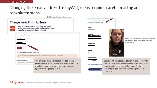
Slide8
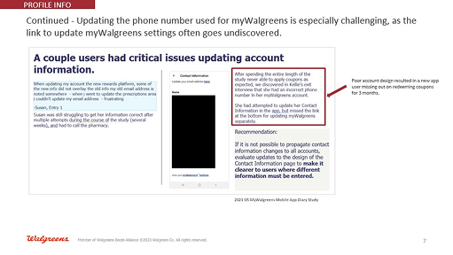
Slide7
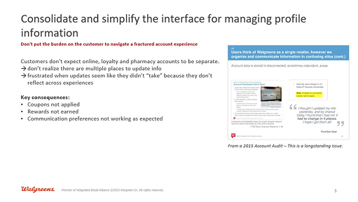
Slide5
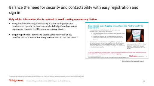
Slide13
Screenshot 2025-03-09 at 4.06.58 PM
Screenshot 2025-03-09 at 4.06.42 PM
E-commerce, Pharmacy, Photo are all very different sub-apps that are packaged into the Walgreens mobile app. Over the years, the user experience diverged heavily, creating fragmentation. I worked with the different teams to unify this under the new design system, payment solutions and enable users to have a better overall engagement with the app.
Learn more about designing the Walgreens chatbot

Payment methods were the Achilles heel of the Walgreens app for more than a decade. But it was not engineering that finally solved it – it was great product and UX design.
By bringing together a full set of payment options, including credit cards, debit, EBT, SNAP, PayPal and more in a simple usable interface, the payment solution singlehandedly transformed cart abandonments and led to a generational leap in user conversions.


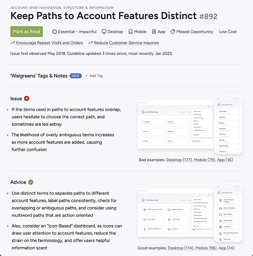
The OneAccount allows users to control their preferences, communication and everything else in one place. Simple, elegant and creating real business value.


